npm i @code_with_sachin/ngx-video-js @videojs/html
@videojs/html — declared as a peer dependency, so you control the version.
Why
Video.js 10 ships its player as custom elements — <video-player> holds the state, <video-skin> is the packaged UI, a plain <video> handles the media. Those elements are framework-agnostic and already do everything: controls, menus, hotkeys, gestures, seek and volume indicators, thumbnail previews, Cast, AirPlay, picture-in-picture. Rebuilding that as Angular components would produce the same DOM from code you then have to maintain.
So this package is the thin Angular layer over them, and nothing more: signal inputs instead of attributes, the right media element picked from the URL, no custom element registration on the server, and no stylesheet to remember to import.
SSR-safe by construction — registering elements no-ops without customElements.
Skin CSS lives in the skin's own shadow root, so nothing leaks into your app.
Definitions register once per document, however many players you render.
Requirements
TESTED AGAINST
NAME
TYPE
DEFAULT
NOTES
@angular/core
^22.0.0
22.0.5
Standalone APIs, signal inputs and afterNextRender are all required.
typescript
~6.0.0
6.0.3
Whatever your Angular version supports.
node
>=20
24.15.0
Build and SSR only.
@videojs/html
^10.0.0-beta.27
10.0.0-beta.27
The custom elements the player wraps. Still beta, so the range is pinned tight.
Peer ranges are wider than this — the table lists the exact versions the demos on this page are running, so you have a known-good combination to fall back on.
Providers
Nothing to register. This package exposes no provider function and reads no injection token — import the component where you use it and you are done. Your app.config.ts needs no change.
Using NgModules
Everything here is standalone, but standalone components and directives are importable from an @NgModule — put them in the module's imports, not declarations. No importProvidersFrom is needed: @NgModule.providers is typed Array<Provider | EnvironmentProviders>, so the provide*() functions drop straight in.
TS · app.module.ts
import { NgModule } from '@angular/core';
import { BrowserModule } from '@angular/platform-browser';
import { NgxVideoPlayer } from '@code_with_sachin/ngx-video-js';

import { AppComponent } from './app.component';

@NgModule({
  declarations: [AppComponent],
  // Standalone components and directives go in `imports`.
  imports: [
    BrowserModule,
    NgxVideoPlayer,
  ],
  bootstrap: [AppComponent],
})
export class AppModule {}
Quick start
Standalone component — import it where you use it. No module, no provider, no stylesheet.
Every input below maps to a template binding, and the three variables at the bottom are plain CSS custom properties that inherit into the skin's shadow root. Drive the player with the keyboard while you are here — the hotkeys are part of the skin, not this page.
Keyboard: space or k play · m mute · c captions · f fullscreen · j/l seek 10s · 0–9 jump. Double-tap the left or right third to seek. All of it ships inside the skin.
HTML
<ngx-video-player
  src="https://stream.mux.com/BV3YZtogl89mg9VcNBhhnHm02Y34zI1nlMuMQfAbl3dM/highest.mp4"
  poster="https://image.mux.com/BV3YZtogl89mg9VcNBhhnHm02Y34zI1nlMuMQfAbl3dM/thumbnail.webp"
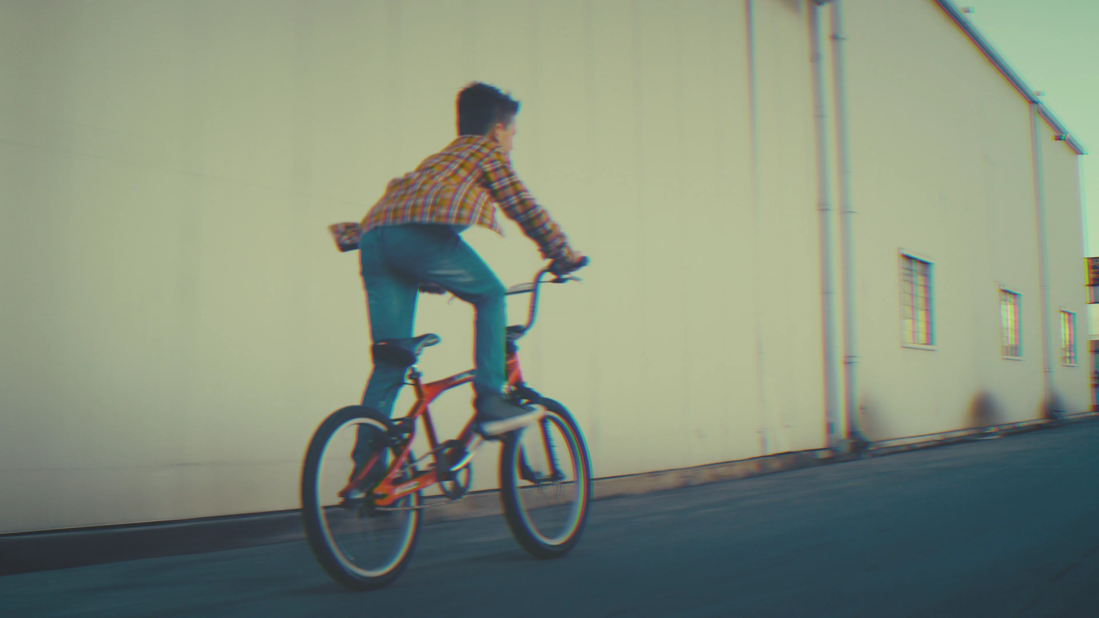
  posterAlt="Cyclist riding past a warehouse at dusk"
  placeholder="https://image.mux.com/BV3YZtogl89mg9VcNBhhnHm02Y34zI1nlMuMQfAbl3dM/thumbnail.webp?width=32"
  crossOrigin="anonymous"
  [tracks]="tracks"
/>

// in the component
readonly tracks: VideoTextTrack[] = [
  {"src":"https://image.mux.com/BV3YZtogl89mg9VcNBhhnHm02Y34zI1nlMuMQfAbl3dM/storyboard.vtt","kind":"metadata","label":"thumbnails","default":true},
];

<style>
  ngx-video-player {
    aspect-ratio: 16 / 9;
    --media-accent-color: #f4771f;
    --media-accent-text-color: #ffffff;
    --media-border-radius: 28px;
    --media-scale-unit: 16px;
    --media-object-fit: contain;
    --media-object-position: center;
    --media-poster-placeholder-blur: 20px;
  }
</style>
SOURCE URLPROVIDER
Detected video from the URL. hls uses <hlsjs-video>, so the quality and audio menus fill in.
UI LANGUAGE
Every label, tooltip and status message in the skin. The pack loads on demand — pick one and watch the network tab. Empty follows the page's own lang attribute.
SKIN
A different element pair, not a mode: live puts a LIVE pill where the duration was and turns the time slider into the DVR window. These samples are recordings, so the pill sits at the edge and stays grey.
STREAM TYPE
Only the live skin renders anything for this. Ignored by native <video> — set it on an hls or dash source.
SKIN PARTS
Each one is an @if in the ejected skin, so an unchecked box means the element is not in the DOM — there is no rule to override and nothing to switch back on. Removing a control also removes its keyboard and gesture equivalents: drop the progress bar and seeking stops working entirely.
The packaged skins keep their UI in a shadow root and expose no switches. Touch any box below and the player swaps to skin="custom", which is where these apply.
LAYERS
PRIMARY ROW
SETTINGS MENU
SECONDARY ROW
INPUT LAYER
CONTROLS
Controls hide themselves when the media says it cannot do the thing, which is the only lever the skin gives you. disableRemotePlayback removes AirPlay and Cast. disablePictureInPicture blocks the browser's own auto-PiP but does not remove the skin's PiP button in 10.0.0-beta.27 — watch it stay put. Both are read when the media attaches, so they remount.
TEXT TRACKS
A track on another origin needs crossorigin below, or the browser drops it. Editing the list remounts the player: adding a track to a live media element makes @videojs/html 10 beta enable one more of the existing tracks too, so two languages end up drawn over each other.
PRELOADCROSSORIGINFLAGS
Poster and the skin variables apply live. Source, provider, tracks, preload, crossorigin and autoplay are read when the media element loads, so those remount the player.
SKIN VARIABLES
--media-object-fit
--media-object-position
Inputs
<NGX-VIDEO-PLAYER>
NAME
TYPE
DEFAULT
NOTES
src
string
—
Required. Set on the inner <video>. MP4, or HLS where the browser plays it natively.
Which media element plays the source. auto reads the URL — host for embeds, extension for manifests.
tracks
VideoTextTrack[]
[]
Subtitles, captions, chapters and thumbnails. Ignored by the iframe embeds.
skin
'video' | 'live' | 'custom'
'video'
video and live are the packaged skins; custom is the ejected one that reads controls.
controls
VideoControls
{}
Which parts of the ejected skin render, each a real @if. Only skin="custom" reads it.
lang
string
''
BCP-47 code for the control labels — 51 packs ship, loaded on demand. Empty follows the page.
streamType
'' | 'on-demand' | 'live'
''
live swaps the duration for a LIVE pill. Empty lets the player infer it from the media.
poster
string
''
Rendered as an <img> in the skin poster slot — you own the tag, so srcset works.
posterAlt
string
''
Alt text for that image. Leave empty when the poster is decorative.
placeholder
string
''
Tiny image blurred behind the poster while it loads. Maps to placeholdersrc.
preload
'none' | 'metadata' | 'auto'
'metadata'
none pairs with a poster for the cheapest first paint.
crossOrigin
'' | 'anonymous' | 'use-credentials'
''
Cross-origin .vtt tracks need 'anonymous', or the browser drops them.
autoplay
boolean
false
Browsers block it unless muted is set too. Read at load, so it needs a remount.
muted
boolean
false
Bound as a property, so it is live.
loop
boolean
false
disableRemotePlayback
boolean
false
Removes the AirPlay and Cast controls. Read when the media attaches, so set it before the player mounts.
disablePictureInPicture
boolean
false
Blocks the browser’s own auto-PiP and context menu. Does not remove the skin’s PiP button — see Removing controls.
playsinline is always set — without it iOS Safari takes the video fullscreen the moment it plays.
Sources
One component, five media elements. The right one is picked from the URL, and only that element is downloaded — a page playing MP4 never fetches hls.js.
HTML
<!-- provider defaults to "auto", which reads the URL:
     youtube.com / youtu.be      -> <youtube-video>   (iframe embed)
     vimeo.com                   -> <vimeo-video>     (iframe embed)
     …m3u8                       -> <hlsjs-video>
     …mpd                        -> <dash-video>
     anything else               -> <video>            -->
<ngx-video-player src="https://youtu.be/aqz-KE-bpKQ" />
<ngx-video-player src="https://stream.mux.com/lhn….m3u8" />
<ngx-video-player src="/media/talk.mp4" />

<!-- Force it when the URL carries no hint — a signed manifest, a
     content-negotiating endpoint, a proxy that strips the extension. -->
<ngx-video-player provider="hls" src="https://cdn.example.com/stream?token=…" />
PROVIDER · ELEMENT · WHAT AUTO MATCHES
NAME
TYPE
DEFAULT
NOTES
video
<video>
anything else
The browser’s own element. MP4, WebM — and HLS on Safari, which plays it natively.
hls
<hlsjs-video>
…m3u8
Full hls.js, so the quality and audio-track menus fill in. Works everywhere, not just Safari.
dash
<dash-video>
…mpd
MPEG-DASH manifests.
youtube
<youtube-video>
youtube.com, youtu.be
An iframe embed. The skin drives it, but text tracks and PiP belong to YouTube.
vimeo
<vimeo-video>
vimeo.com
Same iframe caveats as YouTube.
Captions, chapters and thumbnails
All three are ordinary <track> elements, so they are one input. The skin picks each apart by kind: subtitles and captions become the language list in the settings menu, a chapters track divides the time slider, and a metadata track labelled thumbnails feeds the hover preview.
TS
// One array covers every kind of <track> the skin reads.
readonly tracks: VideoTextTrack[] = [
  // Subtitles and captions fill the settings menu; kind defaults to 'subtitles'.
  { src: '/captions/en.vtt', srclang: 'en', label: 'English', default: true },
  { src: '/captions/hi.vtt', srclang: 'hi', label: 'हिन्दी' },
  { src: '/captions/es.vtt', srclang: 'es', label: 'Español' },

  // Divides the time slider and names the chapter under the pointer.
  { src: '/chapters.vtt', kind: 'chapters', default: true },

  // label:"thumbnails" is the magic pair the hover preview looks for.
  { src: 'https://image.mux.com/BV3…/storyboard.vtt', kind: 'metadata', label: 'thumbnails' },
];
subtitles and captions populate the settings menu.
srclang
string
—
BCP-47 code. The spec requires one on subtitles and captions.
label
string
—
What the menu shows. Use the endonym — हिन्दी, not Hindi.
default
boolean
false
Starts enabled. Chapters and thumbnail tracks need it to be read at all.
Set the array once, before the media element loads, and it is exact. Adding a track to a player that is already running currently makes @videojs/html 10 beta enable one more of the existing tracks alongside it, so two languages draw over each other — reproducible with a plain appendChild, nothing to do with Angular. Until that settles, rebuild the player behind an @if when the list has to change mid-session.
HTML
<!-- A .vtt on another origin is a cross-origin fetch: without this
     the browser drops the track and the captions menu stays empty. The
     server has to send Access-Control-Allow-Origin too. -->
<ngx-video-player
  crossOrigin="anonymous"
  src="https://cdn.example.com/talk.mp4"
  [tracks]="tracks"
/>
What it renders
Worth knowing, because it is what you inspect when something looks wrong — and what you would write by hand if you dropped this wrapper.
HTML
<!-- What the component renders. Three layers: state, packaged
     UI, media — and only the media element changes with the provider. -->
<video-player>
  <video-skin placeholdersrc="…">
    <video src="…" playsinline>
      <track src="/captions/en.vtt" kind="subtitles" srclang="en" label="English" default />
    </video>
    <img slot="poster" src="…" alt="…" />
  </video-skin>
</video-player>

<!-- provider="hls" swaps that one line for <hlsjs-video>, "dash" for
     <dash-video>, "youtube" for <youtube-video>. Nothing else moves. -->
Removing controls
The skin has no per-button switches, and it does not need many: each control asks the media whether it can do the thing and hides itself when the answer is no. That is why the quality and audio menus are missing on a progressive MP4, and why AirPlay never appears outside Safari. The one lever you hold is telling the media it cannot.
HTML
<!-- Removes AirPlay and Cast. -->
<ngx-video-player disableRemotePlayback src="/media/talk.mp4" />

<!-- Blocks the browser's own automatic picture-in-picture and its
     context-menu entry. The skin's PiP button is NOT removed by this
     in 10.0.0-beta.27 — see the note below. -->
<ngx-video-player disablePictureInPicture src="/media/talk.mp4" />
disableRemotePlayback genuinely removes AirPlay and Cast — the availability watch rejects and both buttons go unsupported. disablePictureInPicture does not currently do the same for PiP: 10.0.0-beta.27 derives that button's availability from the browser's capability alone, so the attribute stops the browser's own auto-PiP but leaves the skin's button in place, throwing if pressed. Both are read when the media element attaches, so set them before the player mounts.
The custom skin
skin="custom" renders the default video skin ejected into this package's own Angular template, in light DOM, with every part behind an @if. A part you switch off is not in the document at all — there is no CSS rule for a viewer to override in devtools and no hidden button to re-enable.
TS · lesson.component.ts
import { Component } from '@angular/core';
import { NgxVideoPlayer, type VideoControls } from '@code_with_sachin/ngx-video-js';

@Component({
  imports: [NgxVideoPlayer],
  template: `
    <ngx-video-player skin="custom" [controls]="controls" src="/media/module-3.mp4" />
  `,
})
export class Lesson {
  // Everything defaults to true. These four are gone from the DOM — and with
  // the progress bar go every seeking shortcut, so the restriction holds.
  readonly controls: VideoControls = {
    progressBar: false,
    settingsMenu: false,
    pipButton: false,
    fullscreenButton: false,
  };
}
Removing a control also removes the keyboard and gesture shortcuts that do its job. Drop the progress bar and ←/→, j/l, Home/End, 0–9, the double-tap seek and the seek indicator go with it — otherwise the restriction would be decoration. The same applies to the submenus: closing the settings menu takes </> with it, because a shortcut whose control is unreachable is a way back in.
VIDEOCONTROLS · ALL DEFAULT TO TRUE
NAME
TYPE
DEFAULT
NOTES
poster
layer
—
The poster image shown until playback starts.
bufferingIndicator
layer
—
The spinner shown while waiting for data.
errorDialog
layer
—
The dialog shown when playback fails. Removing it leaves errors silent.
overlay
layer
—
The gradient scrim behind the control bar.
controlBar
primary
—
The whole bar. False removes both rows.
playButton
primary
—
Also removes Space and k.
muteButton
primary
—
Also removes m and the volume arrows.
volumeSlider
primary
—
The popover above the mute button.
currentTime
primary
—
progressBar
primary
—
The seek bar. Also removes every seeking shortcut and the seek indicator.
chapters
primary
—
Chapter segmentation of the seek bar.
thumbnailPreview
primary
—
The thumbnail that follows the pointer.
remainingTime
primary
—
Click toggles remaining and duration.
captionsButton
primary
—
Also removes c, unless the submenu remains.
settingsMenu
menu
—
The gear and its panels.
qualityMenu
menu
—
audioMenu
menu
—
speedMenu
menu
—
Also removes < and >.
captionsMenu
menu
—
castButton
secondary
—
airplayButton
secondary
—
pipButton
secondary
—
Also removes i.
fullscreenButton
secondary
—
Also removes f and the double-tap centre.
hotkeys
input
—
All keyboard shortcuts at once.
gestures
input
—
All tap and double-tap gestures at once.
tooltips
input
—
Hover and focus tooltips on every button.
statusAnnouncer
input
—
Screen-reader announcements. Leave this on.
volumeIndicator
input
—
The bar shown while the volume changes.
statusIndicator
input
—
The captions/fullscreen/PiP flash.
seekIndicator
input
—
The chevrons shown when double-tapping to seek.
Containers collapse on their own: turn off all four buttons in the second row and the row goes, turn off every submenu and the settings trigger goes with them. Changes apply live — it is an Angular template, not a custom element, so nothing remounts. The trade is that the skin's stylesheet travels with the component rather than inside a shadow root, which is about 25 kB gzipped in whichever chunk imports the player, and that you no longer get upstream design updates for free.
Language
51 locale packs ship with @videojs/html, and only the one in use is fetched. Setting lang translates every label, tooltip, menu entry and screen-reader announcement in the skin — there is nothing to register and no strings to maintain.
HTML
<!-- 51 packs ship with @videojs/html; only the one in use is fetched.
     Every label, tooltip, menu entry and status message follows. -->
<ngx-video-player lang="hi" src="/media/talk.mp4" />

<!-- Leave it empty and the player follows the nearest lang attribute,
     so a site that already sets <html lang> needs nothing here. -->
<ngx-video-player src="/media/talk.mp4" />
Live streams
Live is a second packaged skin — <live-video-player> and <live-video-skin> — not a switch on the on-demand one, which has no live controls in its template at all. Setting skin="live" swaps the pair and keeps the media, the tracks and everything projected into it.
HTML
<!-- The live controls are a separate packaged skin, not a mode of the
     on-demand one: a LIVE pill that turns red at the edge where the
     duration would be, and a DVR window on the time slider. -->
<ngx-video-player skin="live" src="https://cdn.example.com/live.m3u8" />

<!-- An endless manifest already reports itself as live, so streamType is
     only for media that cannot say so — a proxy that reports a finite
     duration, a simulated live event, a recording played as live. -->
<ngx-video-player skin="live" streamType="live" src="https://cdn.example.com/dvr.m3u8" />
Anything else
The skin's own hotkeys and gestures are fixed — space, k, m, f, c, i, j/l, arrows, 0–9, </>, plus tap and double-tap. What you can do is add more, and add the sibling components Video.js expects, by projecting them as children. They are not inputs on this component because there is nothing to wrap: they are elements, and the player context already reaches them.
HTML
<!-- Children land beside the media inside the player, which is where
     Video.js expects its sibling components. Register the element
     yourself — this package only pulls in the skin and one media
     element. -->
<ngx-video-player src="/media/talk.mp4">
  <!-- import '@videojs/html/ui/hotkey' -->
  <media-hotkey keys="n" action="seekStep" value="30"></media-hotkey>
  <media-gesture type="doubletap" action="toggleMuted" region="center"></media-gesture>

  <!-- import '@videojs/html/media/google-cast' and '.../mux-data' -->
  <google-cast></google-cast>
  <mux-data env-key="..."></mux-data>
</ngx-video-player>
ACTIONS A HOTKEY OR GESTURE CAN FIRE
NAME
TYPE
DEFAULT
NOTES
togglePaused
hotkey · gesture
—
Play or pause.
toggleMuted
hotkey · gesture
—
toggleFullscreen
hotkey · gesture
—
toggleSubtitles
hotkey · gesture
—
Switches the caption track on and off.
togglePictureInPicture
hotkey · gesture
—
toggleControls
gesture
—
What a single tap does on touch.
seekStep
hotkey · gesture
value: seconds
Negative seeks backward.
volumeStep
hotkey · gesture
value: 0–1
speedUp / speedDown
hotkey · gesture
—
Walks the playback-rate list.
seekToPercent
hotkey
value: 0–100
Without a value, the digit key that fired it decides — 0–9 becomes 0–90%.
Bindings are additive — the skin's own are still there, so a second binding on a key it already uses fires twice.
Sizing
CSS
/* <video-player> is display:contents and <video-skin> is a
   full-width grid, so the player takes its size from the host. */
ngx-video-player {
  max-width: 60rem;
  aspect-ratio: 16 / 9;
}
Theming
Custom properties inherit through shadow boundaries, so setting them on the host reaches the skin without any piercing selector.
Base unit for the whole control layer — raise it for a chunkier player.
--media-object-position
<position>
center
Which part survives the crop when object-fit is cover.
--media-accent-text-color
<color>
auto
Label colour on hovered and focused controls. Derived from the accent unless set.
--media-poster-placeholder
url()
none
What the placeholder input sets for you.
--media-poster-placeholder-blur
<length>
20px
How hard the placeholder is blurred.
Recipes
Three shapes cover most of what a page needs from a video.
Cheap above-the-fold player
PRELOAD
A poster plus preload='none' means one image request on load and no media traffic until someone presses play. The blurred placeholder covers the gap while the poster itself downloads.
HTML
<!-- A poster plus preload="none" is the cheapest above-the-fold
     player: one image, no media request until the viewer presses play. -->
<ngx-video-player
  preload="none"
  src="https://stream.mux.com/BV3…/highest.mp4"
  poster="https://image.mux.com/BV3…/thumbnail.webp"
  placeholder="https://image.mux.com/BV3…/thumbnail.webp?width=32"
  posterAlt="Cyclist riding past a warehouse"
/>
Background hero clip
AUTOPLAY
Muted, looping and cover-fit. Autoplay without muted is blocked by every browser, and both are read when the media element loads — change them behind an @if so the player remounts.
HTML
<!-- Muted, looping, cover-fit: a background clip that still
     carries the full control layer if a viewer reaches for it. -->
<ngx-video-player autoplay muted loop preload="auto" src="/media/loop.mp4" />

<style>
  ngx-video-player { height: 60vh; --media-object-fit: cover; }
</style>
Start the element chunk early
ROUTING
The component registers what it needs on its own. Calling the same function in a resolver just moves that work off the player's critical path — it is memoised per module, and a no-op on the server, so the resolver is safe either way.
TS
import { loadVideoJsElements } from '@code_with_sachin/ngx-video-js';

// Registration is memoised per module and a no-op without customElements, so
// this is safe under SSR and just moves the element chunk off the player's
// critical path. Name the provider to warm hls.js alongside the skin.
export const routes: Routes = [
  {
    path: 'watch/:id',
    resolve: { _elements: () => loadVideoJsElements('hls') },
    loadComponent: () => import('./watch').then((m) => m.Watch),
  },
];
Server rendering
TS · app.routes.server.ts
// app.routes.server.ts — this very page is prerendered.
export const serverRoutes: ServerRoute[] = [
  { path: 'packages/video', renderMode: RenderMode.Prerender },
];

// The component emits <video-player><video-skin><video> on the server and
// never touches customElements. The elements upgrade on hydration; until
// then the browser paints the poster <img>.
//
// The media element is chosen from the URL, so it is already the right tag
// in the prerendered HTML — no swap on hydration.
EXPORTS
NAME
TYPE
DEFAULT
NOTES
loadVideoJsElements(provider?)
(VideoProvider) => Promise<unknown>
('video')
Registers the skin and one media element. Memoised per module and a no-op without customElements, so a route resolver is safe under SSR.
detectProvider(src)
(string) => VideoProvider
—
The rule behind provider="auto". Exported so you can show or override the guess.
Notes
Beta
@videojs/html is at 10.0.0-beta.27 — "close to stable" by its own README, but the element API can still move, and adding text tracks to a running player mis-selects (see above). The peer range is pinned tight for that reason; widen it once v10 ships.
Embeds are not players
YouTube and Vimeo render an iframe the skin drives from outside. Playback, seeking and volume work; text tracks, picture-in-picture and AirPlay stay with the embed, and their menu entries go unavailable. Everything else here is a real media element.
Packaged, not ejected
You get the default skin and its CSS variables. When you need to restructure the UI rather than restyle it, eject the skin per the Video.js guide and compose the media-* elements in your own template — CUSTOM_ELEMENTS_SCHEMA is all Angular needs.
Bundle
The skin and the one media element you need arrive as dynamic imports, so nothing lands in your initial chunk and hls.js is only downloaded by a page that streams HLS. A page with no player pays nothing.